
Recursos Turísticos
About the project
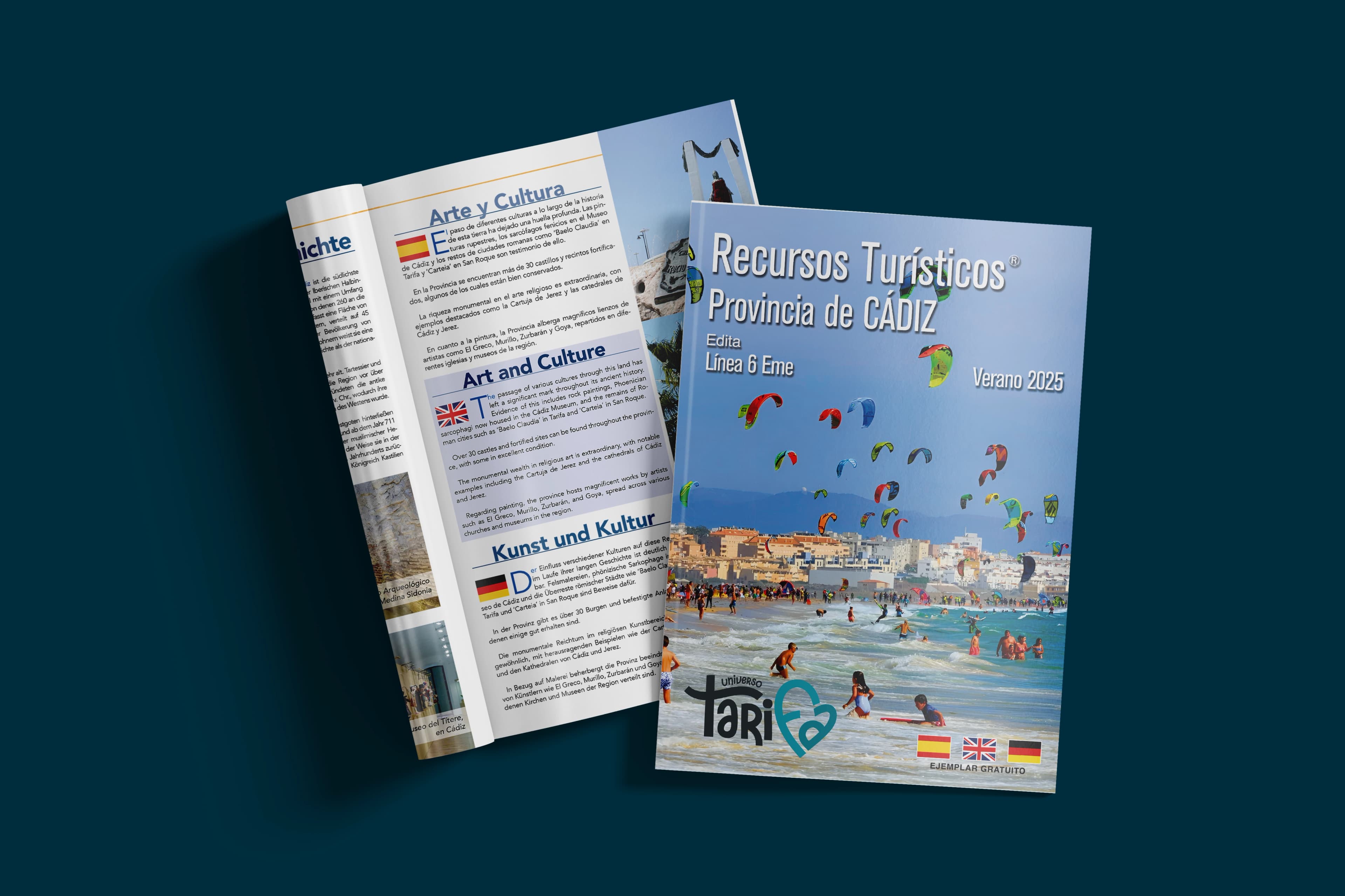
Recursos Turísticos is a biannual tourism magazine for which I handled the full editorial design: cover art direction, interior layout, typographic system, and visual consistency across issues.
Each issue required balancing strong photographic material with structured editorial typography — defining reading hierarchies that work at both the article and the spread level. The grid was built to accommodate varied content formats: feature articles, destination guides, short news pieces, and advertising sections.
Cover design followed a consistent visual language across all issues: a strong full-bleed photograph anchored by the masthead and a restrained typographic composition, designed to work on newsstand and as a standalone piece. The challenge with biannual publication rhythms is maintaining recognisable identity while giving each season its own visual personality.
Interior pages follow a modular three-column grid with defined typographic scales and clear hierarchy between title, deck, body text, and captions. Colour usage was kept minimal — black, white, and a single accent per section — to let photography lead without competing visual noise.
Project details
- Publication
- Recursos Turísticos
- Format
- Biannual magazine
- Role
- Editorial design · Art direction
- Software
- Adobe InDesign