
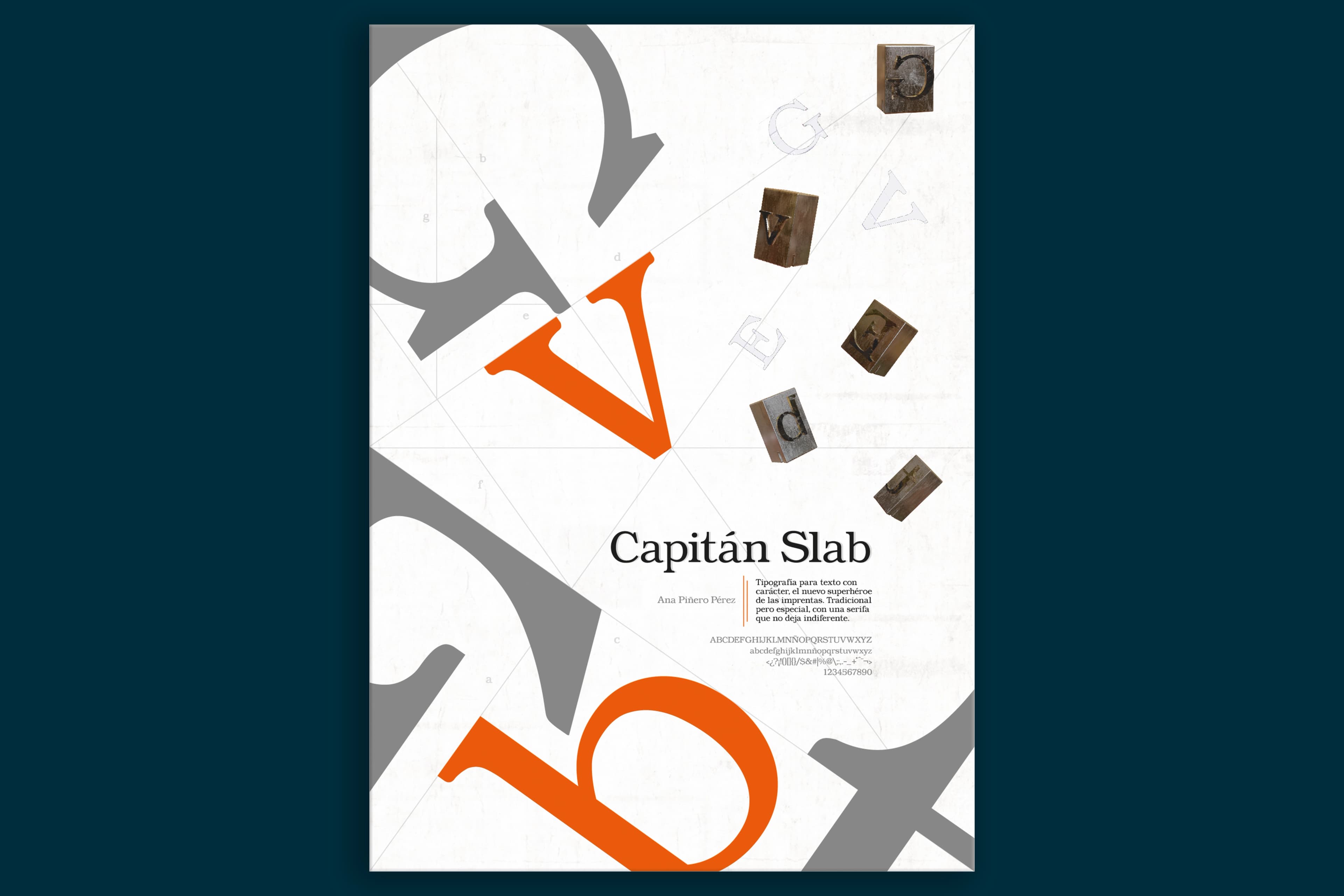
Capitán Slab
About the project
Capitán Slab is a slab serif typeface designed in 2019 for body text. Built around Roman typeface conventions, it prioritises comfort at small sizes, resilience on uncoated paper, and enough personality to hold its own in complex typographic layouts.
The name came from a brainstorm around words like "Egyptian", "slab", "strong", and "Capitana". The final choice, Capitán Slab, captures the typeface's character — strong enough to evoke a comic book superhero, yet smooth and approachable in form.
The design was anchored in a personal collection of wine labels, particularly those from La Capitana, a historic Sherry winery from Jerez. The typography on their Amontillado Fino label features exactly the kind of rounded slab serif that became the core visual reference. Three existing typefaces shaped the design: Clarendon Light for the height-to-width proportions of the bounding boxes, Chelterham Regular for the rounded serif style, and ITC Bookman Std for stroke weight and bowl thickness.
All characters were derived systematically using a lightbox. Starting from a set of key uppercase letters (F, C, A, B, N, I, plus the special cases J and S), every remaining uppercase was drawn as a derivation. Lowercase followed the same method from a second set of base letters (n, l, v, o, with specials a, f, j and g). The J's distinctive hook became a recurring characteristic element throughout the typeface.
Proportions: ascenders and descenders each measure 2.8x, x-height is 6.2x, and cap height equals ascender height — a total body of 9X. The wide counter forms and absence of fine strokes make Capitán Slab resilient on uncoated paper and well-suited to small sizes.
The result is a typeface that feels powerful but never harsh. Its rounded forms give it warmth, its moderate modulation keeps it legible, and its slab serifs give it personality — closer in spirit to Caslon than to a typical Egyptian, which was not entirely the plan, but a welcome outcome.
Project details
- Classification
- Slab serif · Texto corrido
- Designed for
- Body text · Small sizes · Uncoated paper
- Script
- Latin
- References
- Clarendon Light · ITC Bookman · Chelterham